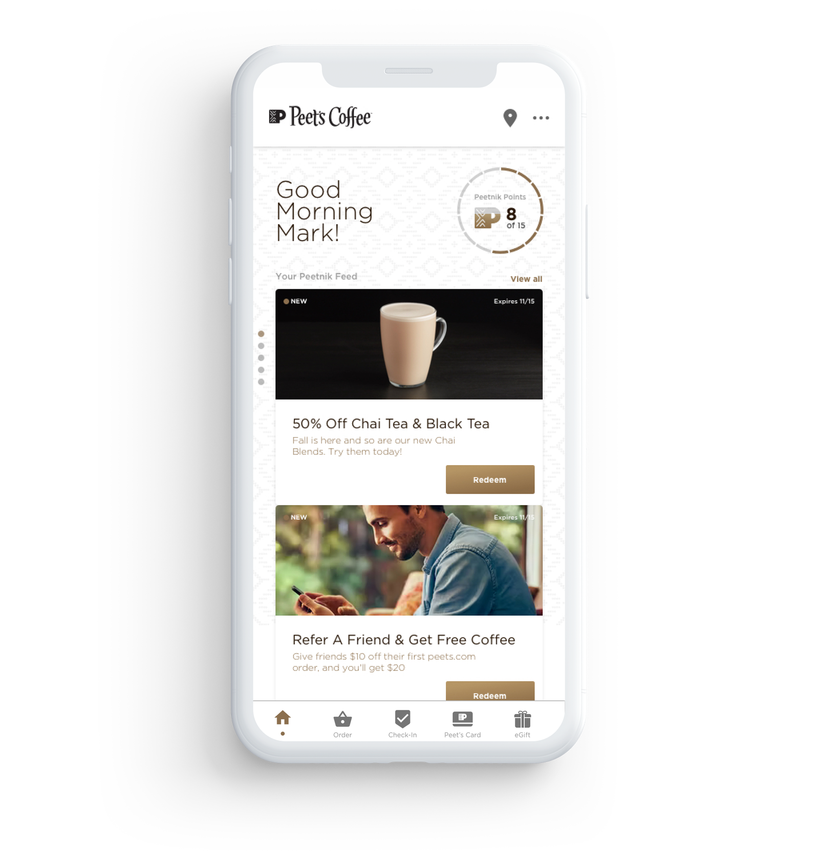
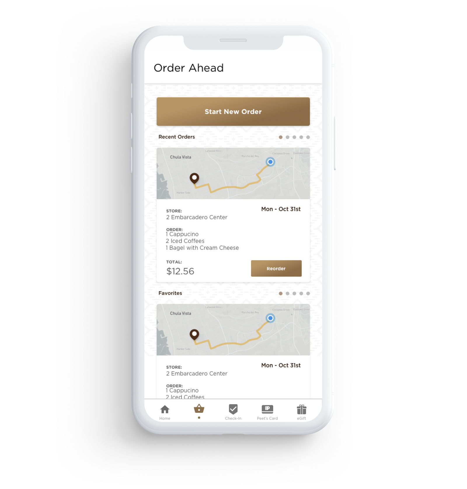
Peet's Coffee User Interface
Founded in Berkeley, California, in 1996, the coffeehouse chain is responsible for introducing fresh, balanced dark roast blends to the United States. The company has 240 stores across the country and a profound legacy that ignited the love that Americans have for specialty coffee today.
Peet’s Coffee and its loyal consumers needed an updated app to support the Peetnik Rewards Program, offering an easy online order process, incorporating a digital wallet, and order ahead capabilities. To deliver an intuitive and successful mobile experience, we relied on UX and accessibility best practices, A/B and beta testing, micro-interactions, and a minimalistic approach that prioritized content based on Peet’s core objectives. We adopted the atomic design methodology, creating the essential elements of the interface and combining them in detailed style guides. The next step was designing the screens and building prototypes, aligning the visual design with Peet’s brand standards. The user flow is focused, and the app is easily navigated, delivering a thought-out and tested experience that the influential coffee brand built on quality deserves.


