The Design Principles of Dieter Rams
This is a custom heading element.
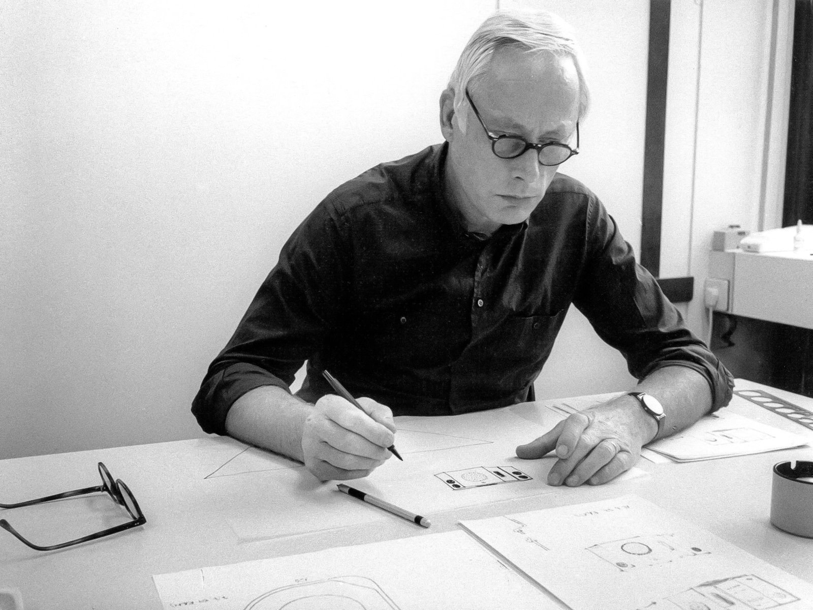
Dieter Rams is a german industrial designer and academic whose legacy still affects the lives of millions around the world. Deeply inspired by his carpenter grandfather, Rams got his foot in the door of the design industry, working for the consumer products Braun in 1955 and remaining at the company until 1995. He also made history designing for the British furniture manufacturer Vitsœ and his famous motto, “Less, but better,” is part of the brand philosophy many influential companies operate with today.
Good design is environmentally friendly
As part of his famous design principles (see the complete list below), Dieter Rams was already tackling an issue that was overlooked in the 50s and 60s. We all know the importance of eco-responsibility today, but plastic was considered the noble material of the future in the post-WWII economic boom. Rams grew up familiar with the disarray caused by the war that left his country in shambles. That scarcity profoundly influenced his views of the industrial designer’s role in the environment and the reconstruction of his nation.
“Design makes an important contribution to the preservation of the environment. It conserves resources and minimises physical and visual pollution throughout the lifecycle of the product.”
The widespread use of slow-degrading products is a worldwide issue present in the accumulation in our oceans. These macro and microplastic particles have been detected in marine organisms, from plankton to whales, in commercial seafood, and even in our drinking water. Remarkably, Dieter Rams was a pioneer in incorporating the ideas of preservation, sustainability, and reducing the eco-footprint in the products he designed, making the ideology one of the pillars of the brands he created for.
Good design is as little design as possible
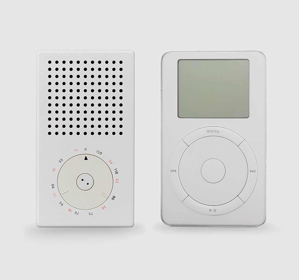
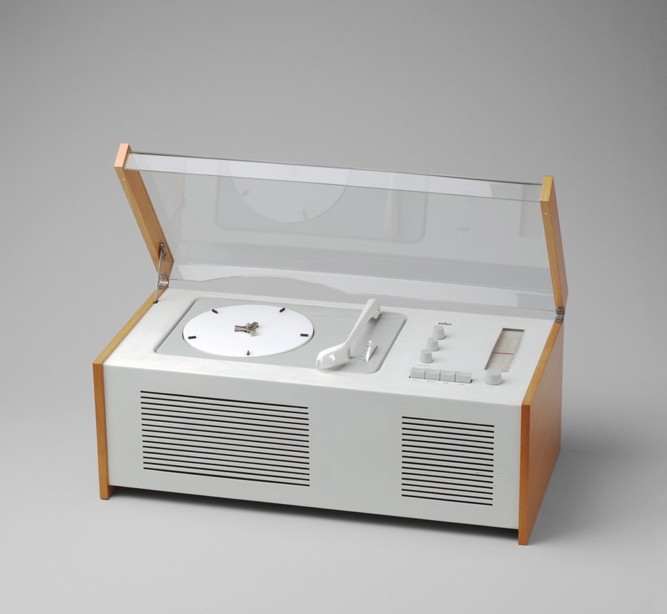
“Simplicity is the key to excellence.” These words encapsulate the whole philosophy Rams, and his team adopted when facilitating the understanding of objects. They aimed to create something so pure and simple that it would make user manuals obsolete. No wonder Steve Jobs incorporated Rams’ thinking when creating Apple products. In 1983 Jobs noted: “What we’re going to do is make the products high-tech, and we’re going to package them cleanly so that you know they’re high-tech. We will fit them in a small package, and then we can make them beautiful and white, just like Braun does with its electronics.”
“The aesthetic quality of a product is integral to its usefulness because products are used every day and have an effect on people and their well-being. Only well-executed objects can be beautiful.”
His minimalistic approach was noted by Jony Ive, who wrote the introduction to “As little design as possible,” a book on Dieter Rams published by Phaidon: “The surfaces were without apology, bold, pure, perfectly-proportioned, coherent and effortless. (…) No part appeared to be either hidden or celebrated, just perfectly considered and completely appropriate in the hierarchy of the product’s details and features.”
The "Rams" Documentary
Dieter Rams is a man who thinks lightly of himself and deeply of the world. And an example of this can be found in Gary Hustwit’s 2018 documentary, Rams. In this film, Hustwit takes us to the house of a very private Rams. From there, he elaborates on his history and way of thinking, not only about design but about consumerism, materialism, sustainability, and other problems of modern society. When asked during a panel what he thinks of Tesla automobiles, Rams (who drives a Porsche) points out that we don’t need faster cars. We need to rethink our entire transportation system. The documentary is a must-watch for designers and non-designers and showcases Dieter’s philosophy on removing distractions and visual clutter and just living with what you need. The film features original music by musician and producer Brian Eno, and it clocks 100% on Rotten Tomatoes.
The Ten Principles
1. Good design is innovative
The possibilities for innovation are not, by any means, exhausted. Technological development is always offering new opportunities for innovative design. But innovative design always develops in tandem with innovative technology, and can never be an end in itself.
2. Good design makes a product useful
A product is bought to be used. It has to satisfy certain criteria, not only functional, but also psychological and aesthetic. Good design emphasises the usefulness of a product whilst disregarding anything that could possibly detract from it.
3. Good design is aesthetic
The aesthetic quality of a product is integral to its usefulness because products we use every day affect our person and our well-being. But only well-executed objects can be beautiful.
4. Good design makes a product understandable
It clarifies the products structure. Better still, it can make the product talk. At best, it is self-explanatory.
5. Good design is unobtrusive
Products fulfilling a purpose are like tools. They are neither decorative objects nor works of art. Their design should therefore be both neutral and restrained, to leave room for the users self-expression.
6. Good design is honest
It does not make a product more innovative, powerful or valuable than it really is. It does not attempt to manipulate the consumer with promises that cannot be kept.
7. Good design is long-lasting
It avoids being fashionable and therefore never appears antiquated. Unlike fashionable design, it lasts many years - even in todays throwaway society.
8. Good design is thorough down to the last detail
Nothing must be arbitrary or left to chance. Care and accuracy in the design process show respect towards the consumer.
9. Good design is environmentally friendly
Design makes an important contribution to the preservation of the environment. It conserves resources and minimises physical and visual pollution throughout the lifecycle of the product.
10. Good design is as little design as possible
Less, but better - because it concentrates on the essential aspects, and the products are not burdened with non-essentials. Back to purity, back to simplicity.
This is a custom heading element.
Dieter Rams is a german industrial designer and academic whose legacy still affects the lives of millions around the world. Deeply inspired by his carpenter grandfather, Rams got his foot in the door of the design industry, working for the consumer products Braun in 1955 and remaining at the company until 1995. He also made history designing for the British furniture manufacturer Vitsœ and his famous motto, “Less, but better,” is part of the brand philosophy many influential companies operate with today.

Good design is environmentally friendly
As part of his famous design principles (see the complete list below), Dieter Rams was already tackling an issue that was overlooked in the 50s and 60s. We all know the importance of eco-responsibility today, but plastic was considered the noble material of the future in the post-WWII economic boom. Rams grew up familiar with the disarray caused by the war that left his country in shambles. That scarcity profoundly influenced his views of the industrial designer’s role in the environment and the reconstruction of his nation.
“Design makes an important contribution to the preservation of the environment. It conserves resources and minimises physical and visual pollution throughout the lifecycle of the product.”
The widespread use of slow-degrading products is a worldwide issue present in the accumulation in our oceans. These macro and microplastic particles have been detected in marine organisms, from plankton to whales, in commercial seafood, and even in our drinking water. Remarkably, Dieter Rams was a pioneer in incorporating the ideas of preservation, sustainability, and reducing the eco-footprint in the products he designed, making the ideology one of the pillars of the brands he created for.

Good design is as little design as possible
“Simplicity is the key to excellence.” These words encapsulate the whole philosophy Rams, and his team adopted when facilitating the understanding of objects. They aimed to create something so pure and simple that it would make user manuals obsolete. No wonder Steve Jobs incorporated Rams’ thinking when creating Apple products. In 1983 Jobs noted: “What we’re going to do is make the products high-tech, and we’re going to package them cleanly so that you know they’re high-tech. We will fit them in a small package, and then we can make them beautiful and white, just like Braun does with its electronics.”
“The aesthetic quality of a product is integral to its usefulness because products are used every day and have an effect on people and their well-being. Only well-executed objects can be beautiful.”
His minimalistic approach was noted by Jony Ive, who wrote the introduction to “As little design as possible,” a book on Dieter Rams published by Phaidon: “The surfaces were without apology, bold, pure, perfectly-proportioned, coherent and effortless. (…) No part appeared to be either hidden or celebrated, just perfectly considered and completely appropriate in the hierarchy of the product’s details and features.”
The "Rams" Documentary
Dieter Rams is a man who thinks lightly of himself and deeply of the world. And an example of this can be found in Gary Hustwit’s 2018 documentary, Rams. In this film, Hustwit takes us to the house of a very private Rams. From there, he elaborates on his history and way of thinking, not only about design but about consumerism, materialism, sustainability, and other problems of modern society. When asked during a panel what he thinks of Tesla automobiles, Rams (who drives a Porsche) points out that we don’t need faster cars. We need to rethink our entire transportation system. The documentary is a must-watch for designers and non-designers and showcases Dieter’s philosophy on removing distractions and visual clutter and just living with what you need. The film features original music by musician and producer Brian Eno, and it clocks 100% on Rotten Tomatoes.
The Ten Principles
1. Good design is innovative
The possibilities for innovation are not, by any means, exhausted. Technological development is always offering new opportunities for innovative design. But innovative design always develops in tandem with innovative technology, and can never be an end in itself.
2. Good design makes a product useful
A product is bought to be used. It has to satisfy certain criteria, not only functional, but also psychological and aesthetic. Good design emphasises the usefulness of a product whilst disregarding anything that could possibly detract from it.
3. Good design is aesthetic
The aesthetic quality of a product is integral to its usefulness because products we use every day affect our person and our well-being. But only well-executed objects can be beautiful.
4. Good design makes a product understandable
It clarifies the products structure. Better still, it can make the product talk. At best, it is self-explanatory.
5. Good design is unobtrusive
Products fulfilling a purpose are like tools. They are neither decorative objects nor works of art. Their design should therefore be both neutral and restrained, to leave room for the users self-expression.
6. Good design is honest
It does not make a product more innovative, powerful or valuable than it really is. It does not attempt to manipulate the consumer with promises that cannot be kept.
7. Good design is long-lasting
It avoids being fashionable and therefore never appears antiquated. Unlike fashionable design, it lasts many years - even in todays throwaway society.
8. Good design is thorough down to the last detail
Nothing must be arbitrary or left to chance. Care and accuracy in the design process show respect towards the consumer.
9. Good design is environmentally friendly
Design makes an important contribution to the preservation of the environment. It conserves resources and minimises physical and visual pollution throughout the lifecycle of the product.
10. Good design is as little design as possible
Less, but better - because it concentrates on the essential aspects, and the products are not burdened with non-essentials. Back to purity, back to simplicity.
Mario Bava - Master of the Macabre
This is a custom heading element.
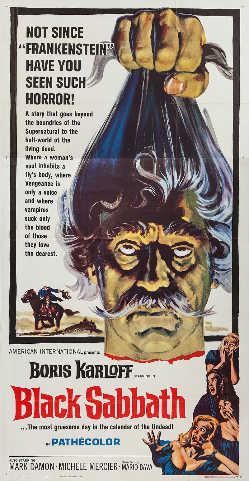
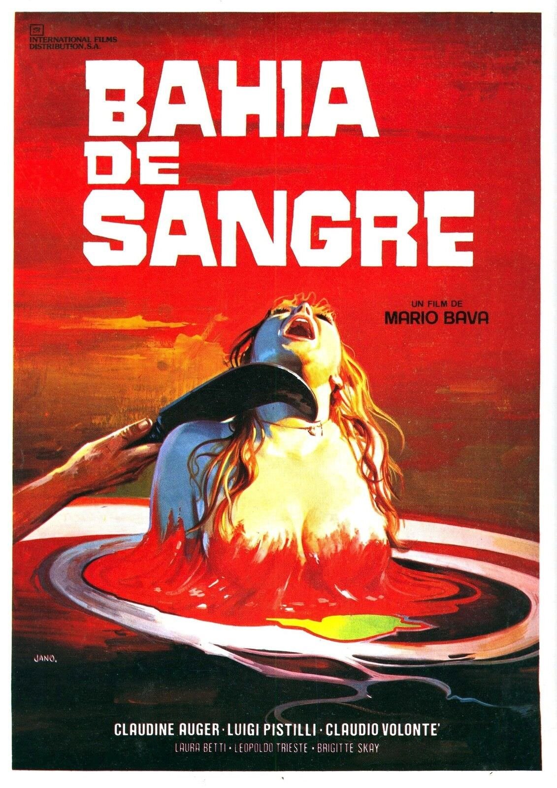
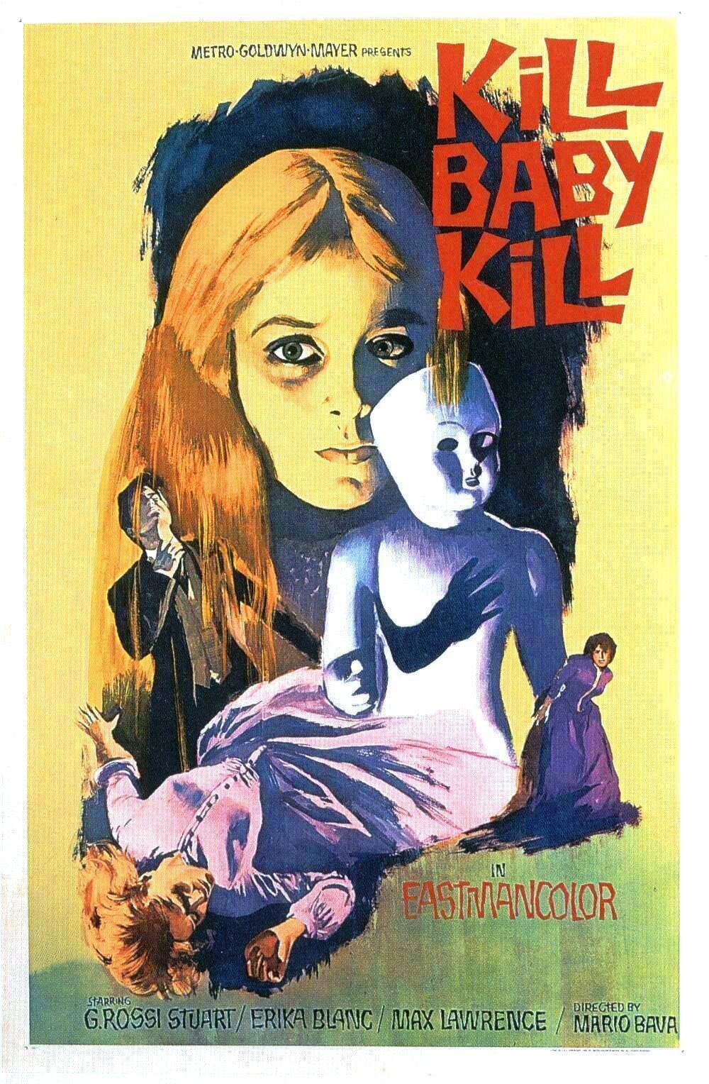
Mario Bava was an Italian director that influenced names like Martin Scorsese, Tim Burton, Quentin Tarantino, John Carpenter, and Guillermo del Toro and is credited with being one of the progenitors of the American slasher movies from the 80s like Friday the 13th and Nightmare on Elm Street. With moody atmospheres and masked killers in brutal murder scenes, Bava and his contemporaries often worked with low budgets and short shooting schedules, creating titles labeled vulgar and unsophisticated by the critics of his time, rarely reaching commercial success.
To make matters worse, distributors usually altered the director’s cut and overdubbed versions in English for the international market. With so many variants, it is curious how his movies stood the test of time and became cult classics among the thriller, horror, and science fiction genres.
The Giallo Cinema Movement
Cheap and popular storybooks with yellow covers inspired the Giallo (yellow in Italian) films. The publications were similar to the pulp magazines in the United States, and the narrative often had the same theme: a masked killer terrorizes countless victims, and the mystery of the murderer’s identity is revealed at the end of the plot.
So it’s safe to say that the storyline is not the only factor in Bava’s influential position in the movie industry. What is gripping in his work is his storytelling and cinematographic skills.
The dedication to perfection is present in his every frame. Mario Bava was a son of a sculptor and cinematographer and dreamed of becoming a painter at a young age. In a way, he followed his dream of becoming an artist, only using a different medium. His monochromatic photography is widely hailed, and his use of color is striking in a way that can help define the visual language of the 60s and 70s. His influence transcended the big screen to visual artists like Andy Warhol and Roy Lichtenstein and musicians like the heavy metal godfathers – Black Sabbath.
Today, his most acclaimed titles are available, restored in high definition, and faithful to Bava’s vision. If you are like me, a fan of disturbing and morbid tales, a dive into his world is a must, a lesson in visual composition on how to paint violent pictures into a work of art.
This is a custom heading element.
Mario Bava was an Italian director that influenced names like Martin Scorsese, Tim Burton, Quentin Tarantino, John Carpenter, and Guillermo del Toro and is credited with being one of the progenitors of the American slasher movies from the 80s like Friday the 13th and Nightmare on Elm Street. With moody atmospheres and masked killers in brutal murder scenes, Bava and his contemporaries often worked with low budgets and short shooting schedules, creating titles labeled vulgar and unsophisticated by the critics of his time, rarely reaching commercial success.
To make matters worse, distributors usually altered the director’s cut and overdubbed versions in English for the international market. With so many variants, it is curious how his movies stood the test of time and became cult classics among the thriller, horror, and science fiction genres.

The Giallo Cinema Movement
Cheap and popular storybooks with yellow covers inspired the Giallo (yellow in Italian) films. The publications were similar to the pulp magazines in the United States, and the narrative often had the same theme: a masked killer terrorizes countless victims, and the mystery of the murderer’s identity is revealed at the end of the plot.
So it’s safe to say that the storyline is not the only factor in Bava’s influential position in the movie industry. What is gripping in his work is his storytelling and cinematographic skills.
The dedication to perfection is present in his every frame. Mario Bava was a son of a sculptor and cinematographer and dreamed of becoming a painter at a young age. In a way, he followed his dream of becoming an artist, only using a different medium. His monochromatic photography is widely hailed, and his use of color is striking in a way that can help define the visual language of the 60s and 70s. His influence transcended the big screen to visual artists like Andy Warhol and Roy Lichtenstein and musicians like the heavy metal godfathers – Black Sabbath.
Today, his most acclaimed titles are available, restored in high definition, and faithful to Bava’s vision. If you are like me, a fan of disturbing and morbid tales, a dive into his world is a must, a lesson in visual composition on how to paint violent pictures into a work of art.
Guitar Pick Business Cards
This is a custom heading element.
I’ve run into situations in the past where I forgot to bring business cards to a meeting or a guitar pick to band practice. To solve both problems with one design, I’ve decided to unite the two passions in my life on a piece of personal branding. I am a musician and a designer for those who don’t know me.
They also glow in the dark, making them easy to find if you drop them on a dark stage. 🤘🎸


